Rentwise
I created a spec app called Rentwise to help renters learn more about different buildings, landlords, and neighborhoods. I went through every step of the UX design process, from user research to paper sketches to a high-fidelity clickable prototype.
Problem Overview
Most renters don’t have any way to identify potential problems in their future homes. Without the formality of a homeowner’s inspection, apartment hunters usually have to “go with their gut” based on the how the unit looks.
I wanted to develop an app that would help renters in large metro areas get background info for any apartment building or complex that they’re considering, simply by entering the address.
Research - Background
I talked to four renters in large metro areas about:
-How they currently research rentals they’re considering
-Their overall apartment hunting criteria
-Previous issues they’d dealt with in rentals
-Which features they’d want in a digital product
I also used an online survey with similar questions.
View the full Miro board here
Research - Key Findings
What previous issues had renters dealt with?
Renters had previously experienced issues with maintenance, noise, pests, and management
What do renters consider as they’re looking for an apartment?
Renters were most concerned about management, maintenance, affordability, and the surrounding neighborhood
What information would users want to be able to find in an app?
Renters mentioned:
Building/apt. complex reviews
Landlord reviews
Neighborhood reviews
Court records
Local records about building complaints/code violations
Proximity to public transportation/highways
Average area rents
Personas
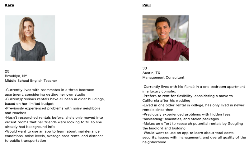
Based on my research, I created two personas:
Lo-Fi Mockups
Lo-Fi Prototype Testing
I took the lo-fi mockups and created a clickable prototype using Figma.
Seven users tested the clickable prototype. Most users said it was simple enough to use the app; but two users mentioned that the building and landlord screens took too long to scroll through.
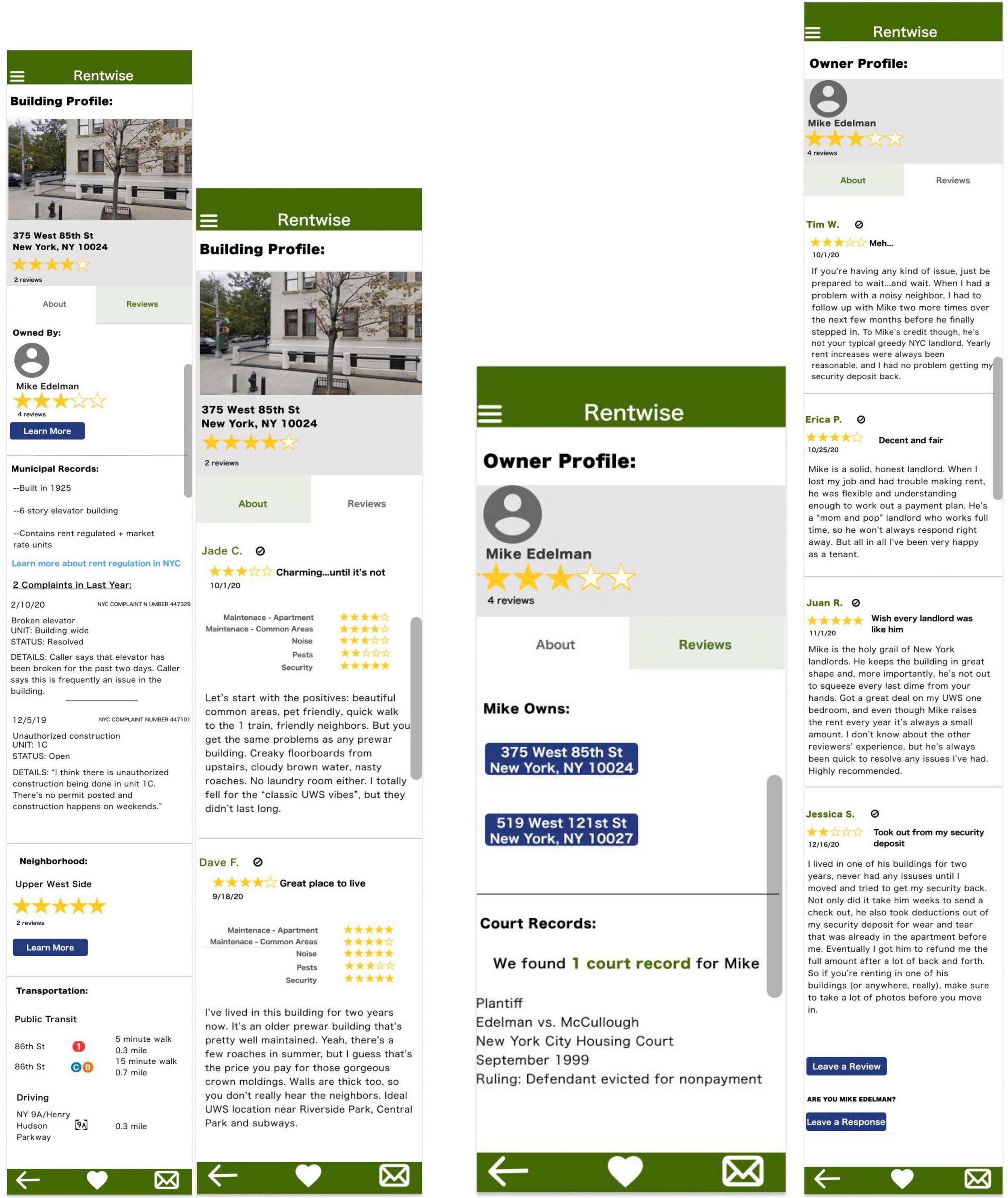
I incorporated this feedback into a high-fidelity version that used separate tabs for “About” and “Reviews” within the landlord, neighborhood, and building pages to streamline the content.
Style Guide
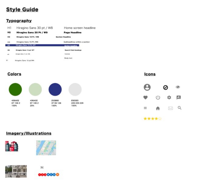
I created a basic style guide and pattern library before moving on to the high fidelity prototype.
High Fidelity Mockups & Prototype
High Fidelity Prototype Testing
Ten people tested the high-fidelity prototype. 70% of users said the app was “easy to use.”
Still, I also identified areas for future improvement: 30% of users said they’d prefer the back button moved to the top nav, while 20% of users thought the display was too large and could be scaled down.


